What In-App Product Announcements Get Wrong
I saw my first internet pop-up in the early 2000s. No doubt it was on a game website and no doubt it was an advertisement selling me something. I clicked the X to close out.
It could have been the most relevant ad and the greatest product of all time. It didn't matter. Pop-ups, whether ads from the early 00s or today's in-app product announcements suffer from the same underlying issue — they interrupt you.
This is not an earth shattering insight.
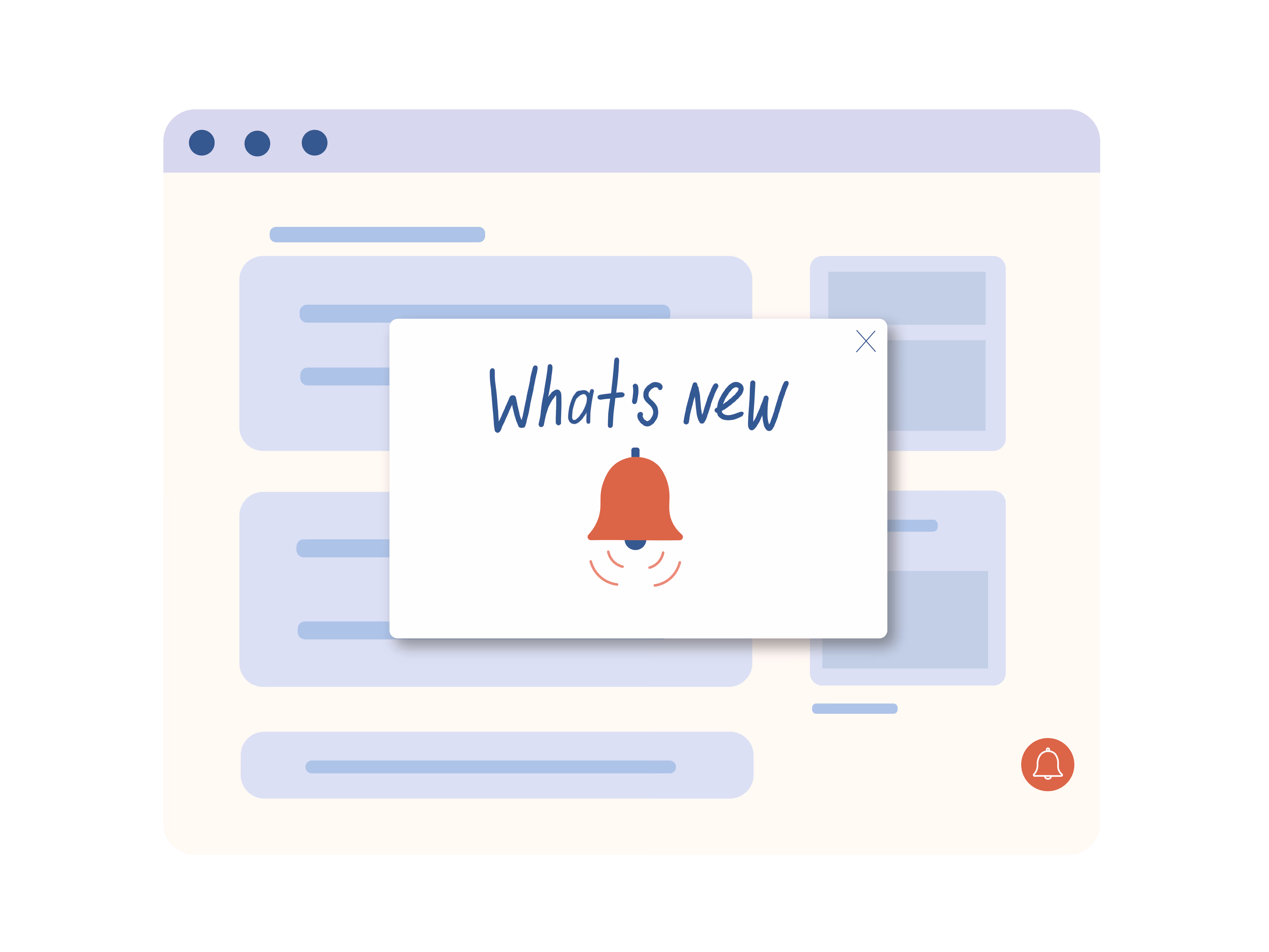
Distractions are an annoyance we experience and talk about ad nauseam. And yet, pop-ups still exist. "What's new" in-app product announcements may seem like they can skirt this annoyance because we can target the right users on the right screen. But they don't.
They still ignore a huge variable — timing.
I came here to make progress
In most cases this can't be circumvented. When people sign in to your service they're doing so to make progress. A "what's new" pop-up inhibits the progress your users are trying to make because it needs to be addressed.
An in-app product announcement pop-up has little regard for time or emotional state.
So while your users may have been waiting for this shiny new feature for months, it wont matter because they came here to do something else.
It's like picking up the phone to call Grandma, but before you make the call you hear about all the new things your phone can do. "New speed dial enhancements!...press 1 to exit."
Dismiss fatigue
The need to address something not related to what you came to do is extra work. It results in dismiss fatigue. After a while dismiss fatigue turns in to exhaustion. People shouldn't be exhausted before they start what they came to do with your product.
When you start something exhausted or out of breath the main focus is getting back air back to your lungs. Not what you came to do in the first place. We want people to adopt and engage with new features but they should be in the right headspace.
An alternative
Passive patterns for "what's new" in the product are becoming more commonplace. Here are a few companies we've found who are doing it well:
Airtable
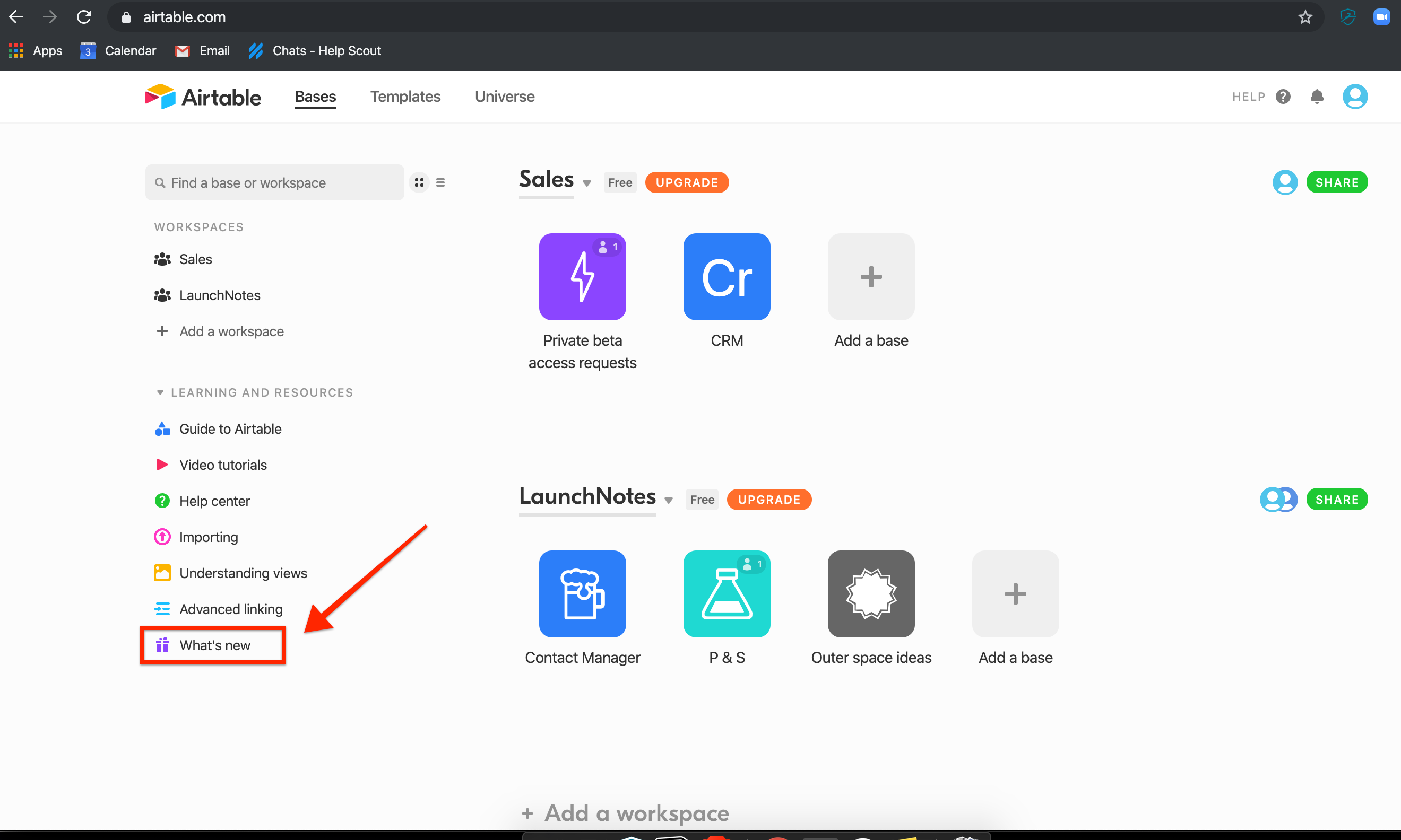
Airtable keeps a persistent left hand nav item that can be accessed at any time. It's eye catching in that it is ever present on this dashboard view, but it doesn't need to be "addressed" necessarily.
HelpScout

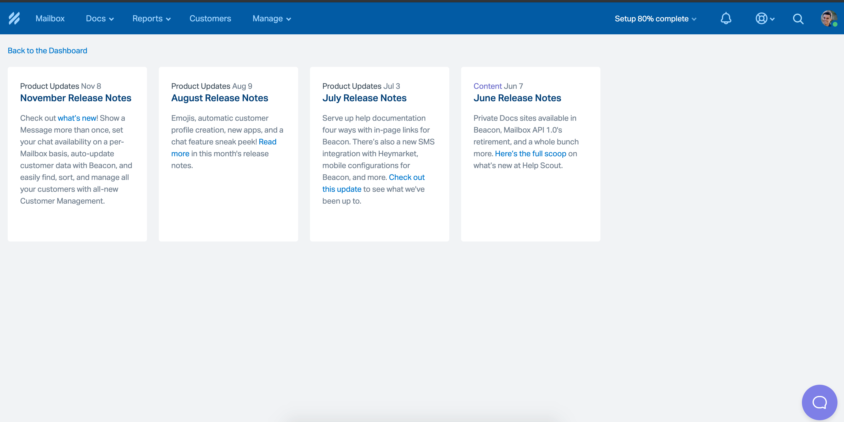
HelpScout put their in-app product updates in a discrete dropdown on the top nav. This ensure intent from their users that have the time and are interested in exploring what's new.
Postmarkapp
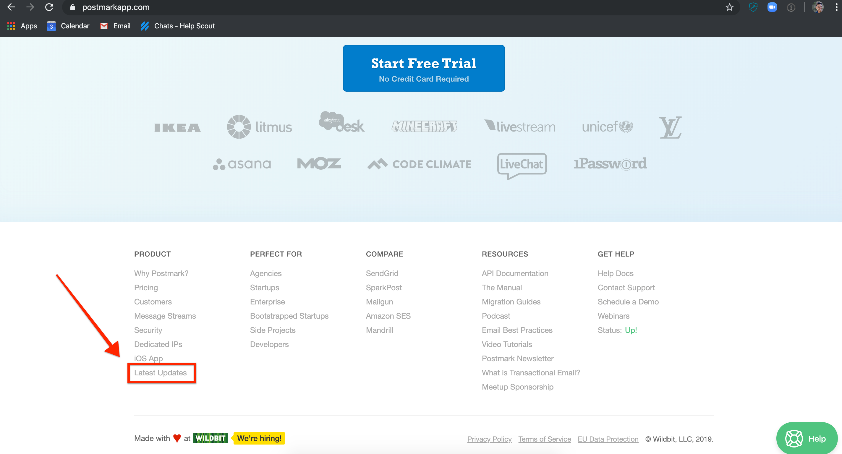
Postmark keeps an ever present element in the footer of the marketing site. The ability to opt in to email notifications brings the "new announcement!" to their inbox where they're expecting this type of message.
Wrap
Pop-up in-app product announcements are well intentioned but the timing is off. They aim to be useful and as relevant as possible when they POP but it still feels like work.
Passive discovery of "what's new" keeps your users time, emotional state and focus top of mind when using your product.