Release Notes Examples

How to use these examples
Each example links to a real updates page and shows what we like about it. Steal structure, voice, and visual habits—not copy. Copyable formats live on release note templates. Craft guidance is on how to write.
Pattern taxonomy (quick map)
| Pattern | What it looks like | Best when | Watch for |
|---|---|---|---|
| Timeline / feed | Reverse-chronological cards or posts | Frequent shipping; mixed audiences | Noise without tiers or filters |
| Categorized list | Added / improved / fixed groupings | Technical readers; dense releases | Jargon without customer outcomes |
| Product-as-page | Updates rendered inside the product UI metaphor | Product-led brands with strong UI | Cleverness that hurts findability |
| Announcement stories | Marketing-grade feature narratives | Tier-1 launches | Skipping the permanent record |
Collaboration & communication
Airtable
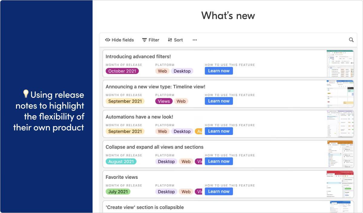
What they do: Airtable provides a no-code platform for creating and sharing relational databases.
What we like: Using your own product to present public-facing content doesn't always work. It can be a clumsy user experience or feel like a stunt. But we’re really impressed with the way Airtable uses their app to display their release notes. It helps the audience see their product in a new way, and gets in front of the people who are already familiar with the product UI.
Atlassian Jira
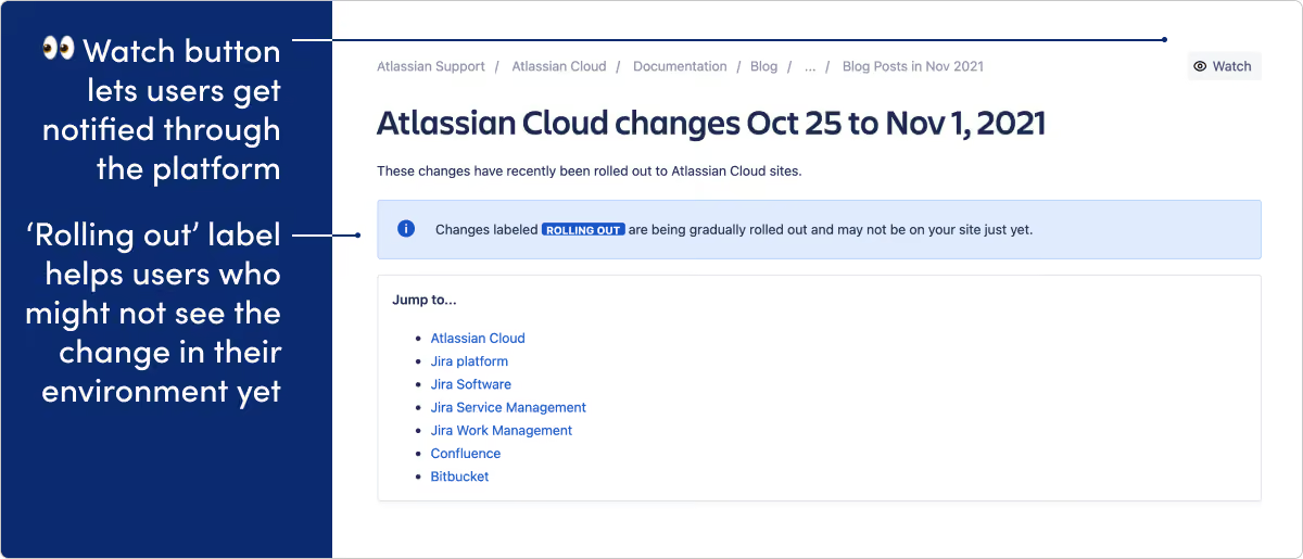
What they do: Jira Software is an agile project management tool for teams.
What we like: The “rolling out” label is a nice touch here. More and more, modern software development teams push updates in phased batches rather than all at once. This means a change may be visible to one user but not another. The rolling out label helps clear up any confusion that might cause. We also think the “watch” option is nice, and gives users notifications on release updates inside the actual applications.
Coscreen
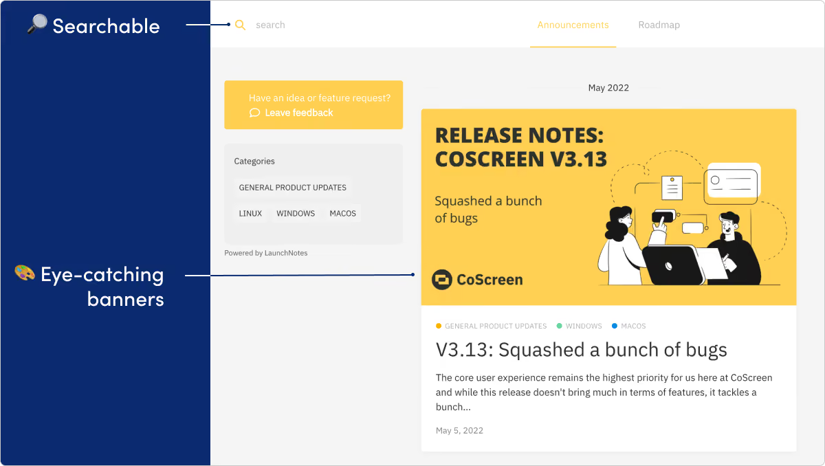
What they do: CoScreen provides screen sharing software designed to facilitate remote collaboration.
What we like: For a product that's all about visual communication, CoScreen nails the visual side of their release notes. We're big fans of the custom banners for each release. The CoScreen team does a great job filling their notes with helpful screenshots and gifs.
Discord
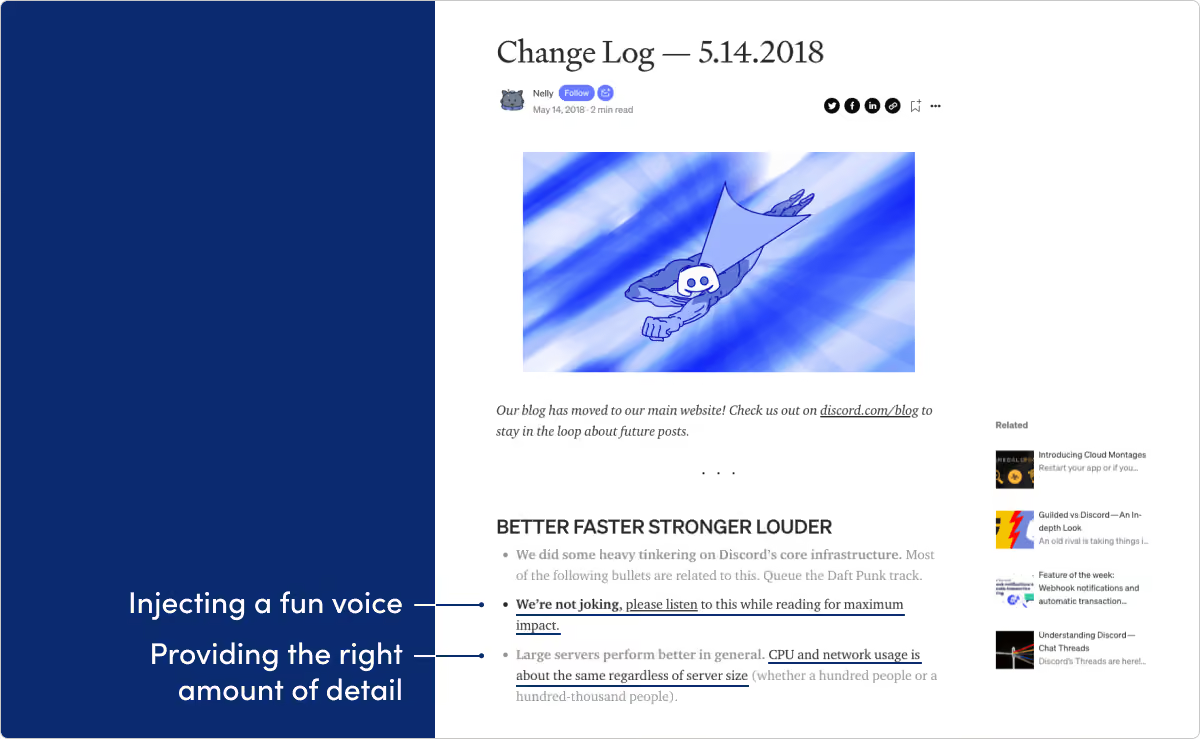
What they do: Discord builds an online chat platform for communities.
What we like: There’s a lot to like here. Discord’s updates are written with a ton of voice and heavy dash of humor. They know their audience, and we think it works great. Also worth checking out is the technical changelog within their developer documentation at discord.com/developers/docs/change-log.
HEY
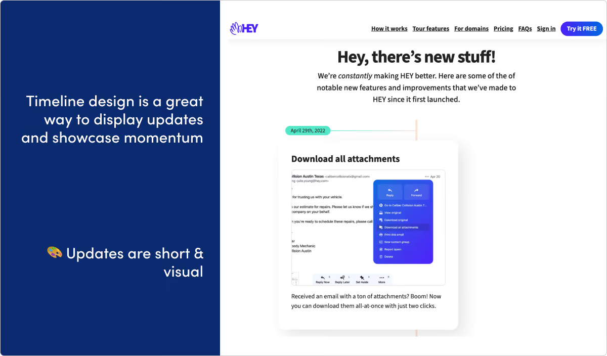
What they do: Hey is a new kind of email service from the makers of Basecamp.
What we like: The timeline layout on this page is a really nice touch. The updates are punchy and visual, and we expect the page design helps reinforce these good habits.
LaunchNotes
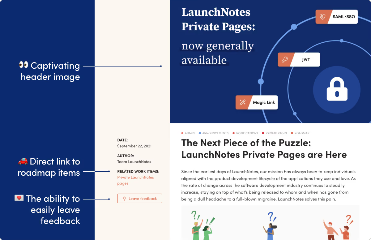
What they do: Hey, that’s us! LaunchNotes helps your teams and your users stay ahead of upcoming product changes.
What we like: We’re biased here, but we spend a lot of time thinking about release notes and try to always put our latest skills and thinking into our own page. And we of course use our own product for this page. Check it out sometime.
Loom
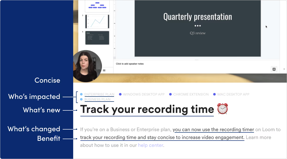
What they do: Loom brings video messaging to the workplace.
What we like: As a fast-growing and still young startup, Loom has great cadence of shipping features fast. We like how specific and benefit-focused these release notes are. And as a visual-product, we also love to see the complimentary screenshots.
MURAL
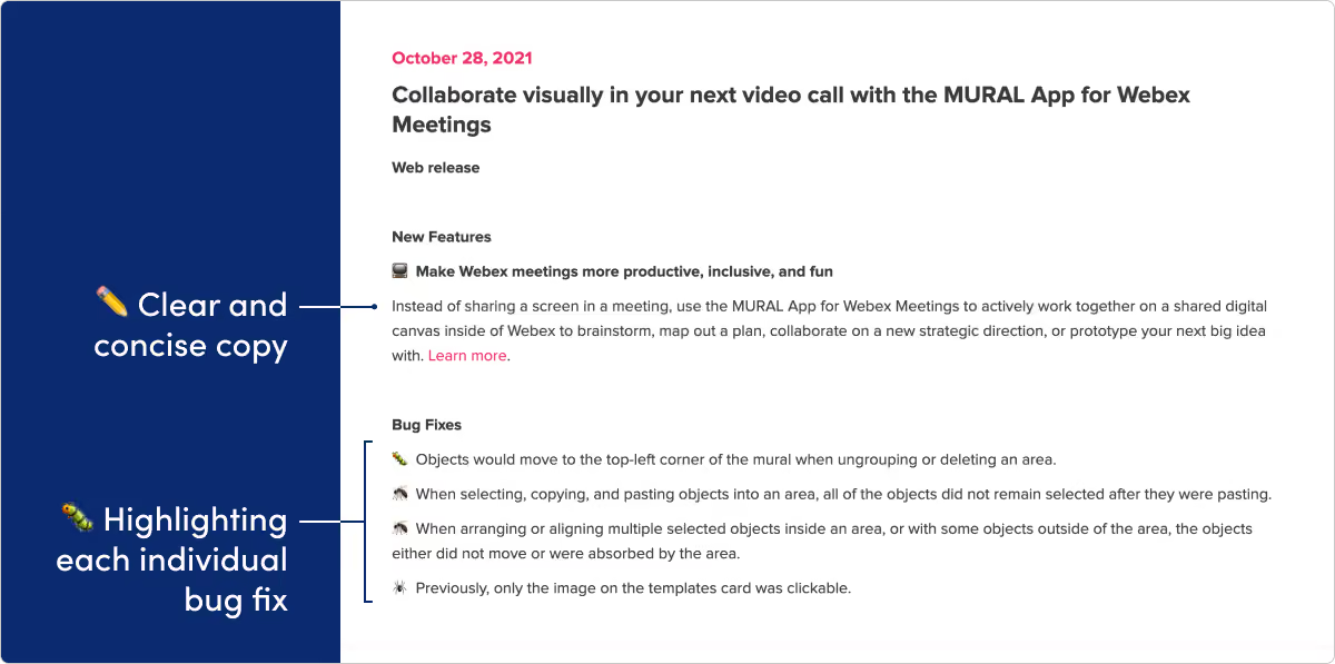
What they do: Mural makes a collaborative, online digital workspace tool.
What we like: It’s become industry standard to lump any and all bug fixes into a generic “bug fixes” line. But we like how Mural describes each fixed bug one-by-one. It helps users better see the scope and detail of improvements to the platform and view bug fixes as important progress, not just a dull chore.
Notion
What they do: Notion provides an all-in-one knowledge base and workspace for teams.
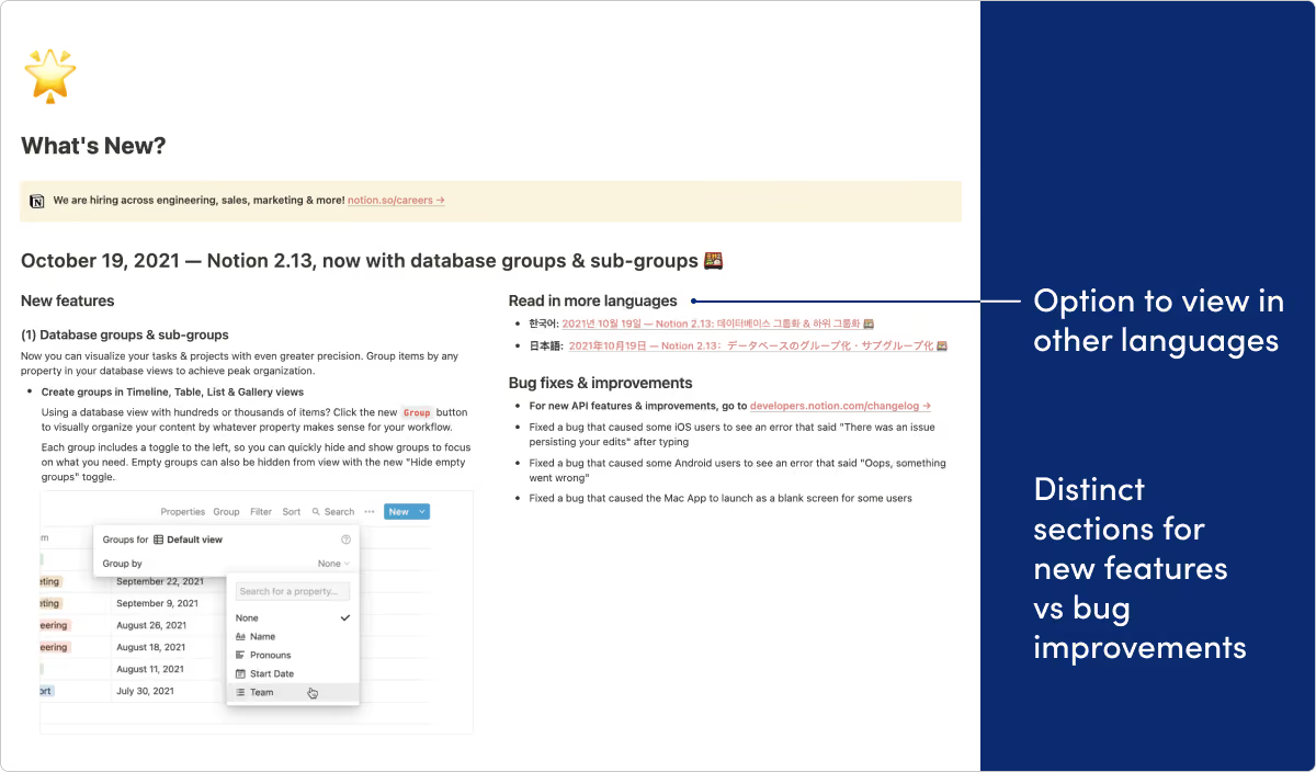
What we like: Here’s another example of a team using their own product for release notes in a really effective way. Splitting up new features and bug improvements into separate sections is a nice touch as well. And we love all the creative uses of illustrations and gifs.
Omnify
What they do: Omnify builds a reservation system used by sports facilities, recreational clubs, and more.
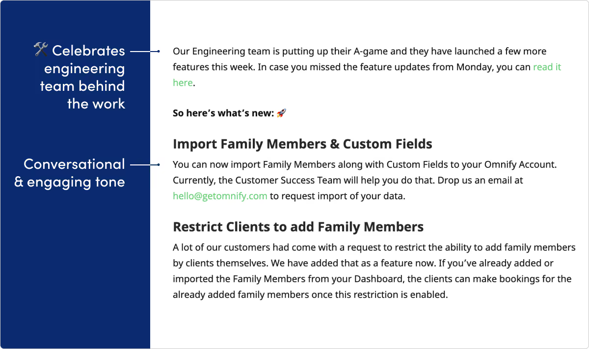
What we like: If anyone said release notes are supposed to be dull, the Omnify team did not get the memo. Omnify’s page is filled with emojis, gifs, pop culture references. All while still delivering some informative and important release info. We especially love the way they celebrate their engineers in the updates.
Reclaim

What they do: Reclaim is an intelligent calendar assistant.
What we like: Reclaim does a great job using images and other visual elements to make updates easy to consume. They also have a great cadence of updates, which shows development momentum and creates trust with customers.
Slack
What they do: Slack is a real-time communication platform for teams.
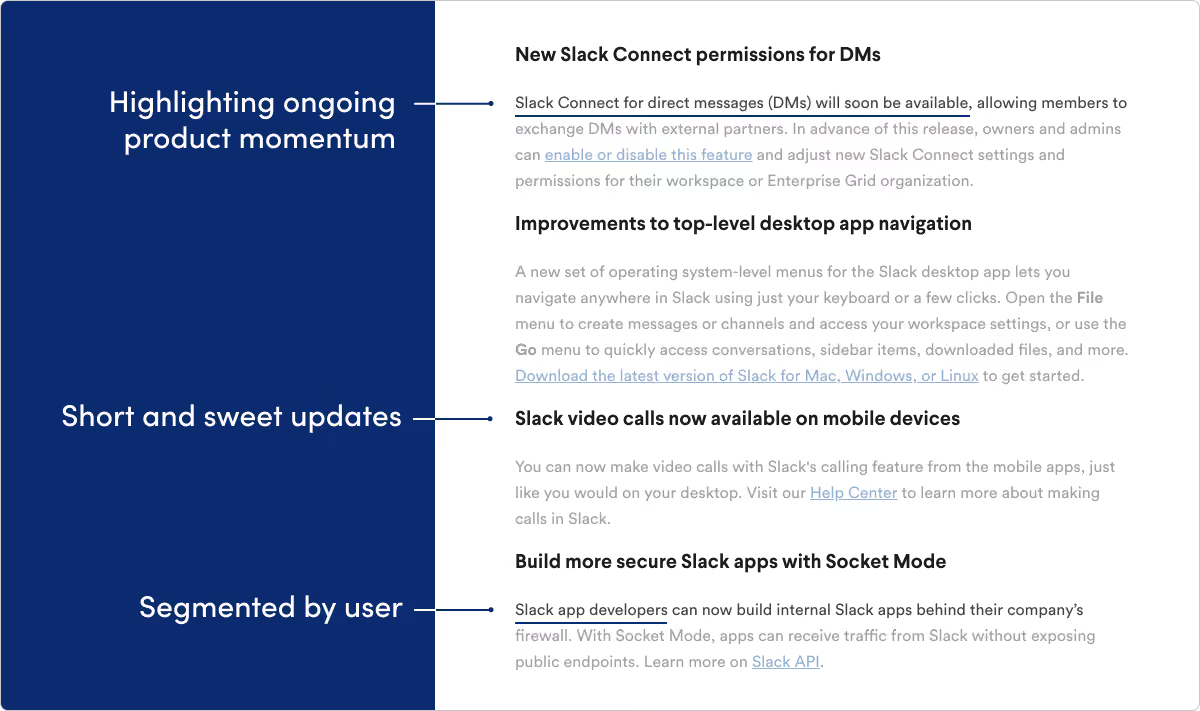
What we like: Slack is a massive product that reaches millions of end users across different platforms (mobile, Windows, Mac, etc.). We like the way they keep audience segmentation front-of-mind within their product release notes. They also do a nice job showing product momentum by quickly teasing features in development.
Teamwork
What they do: Teamwork builds software tools for project management.
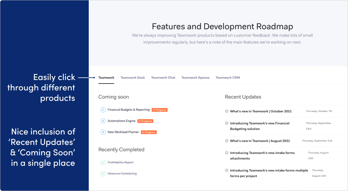
What we like: Blending recent updates with a product roadmap on one page is tough to pull off. We’ve definitely seen it backfire, but we’re impressed with the way Teamwork delivers this page to drive product team alignment. We also like the tabbed categories feature, which helps visitors easily navigate across the product family.
Whereby
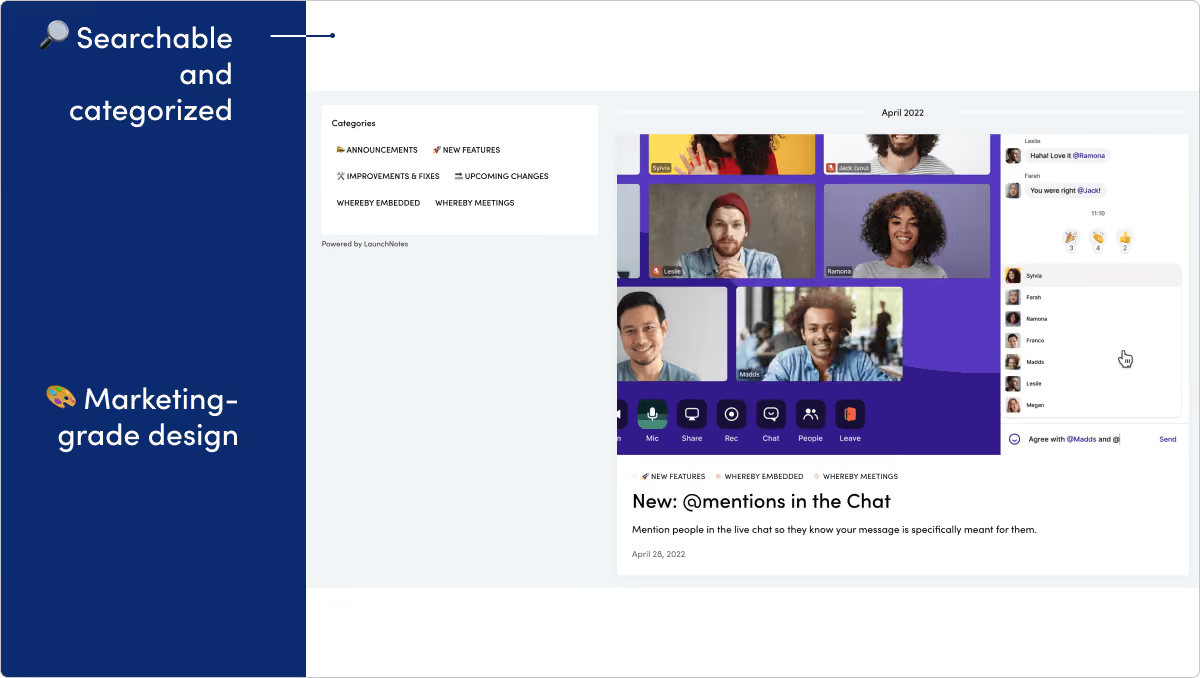
What they do: Whereby creates a software platform for video meetings, video conferencing, and screen sharing.
What we like: Whereby's release notes page is truly "marketing grade." The clear writing, polished visuals, and playful use of emoji all come together to make an excellent page.
Customer support and experience
Help Scout
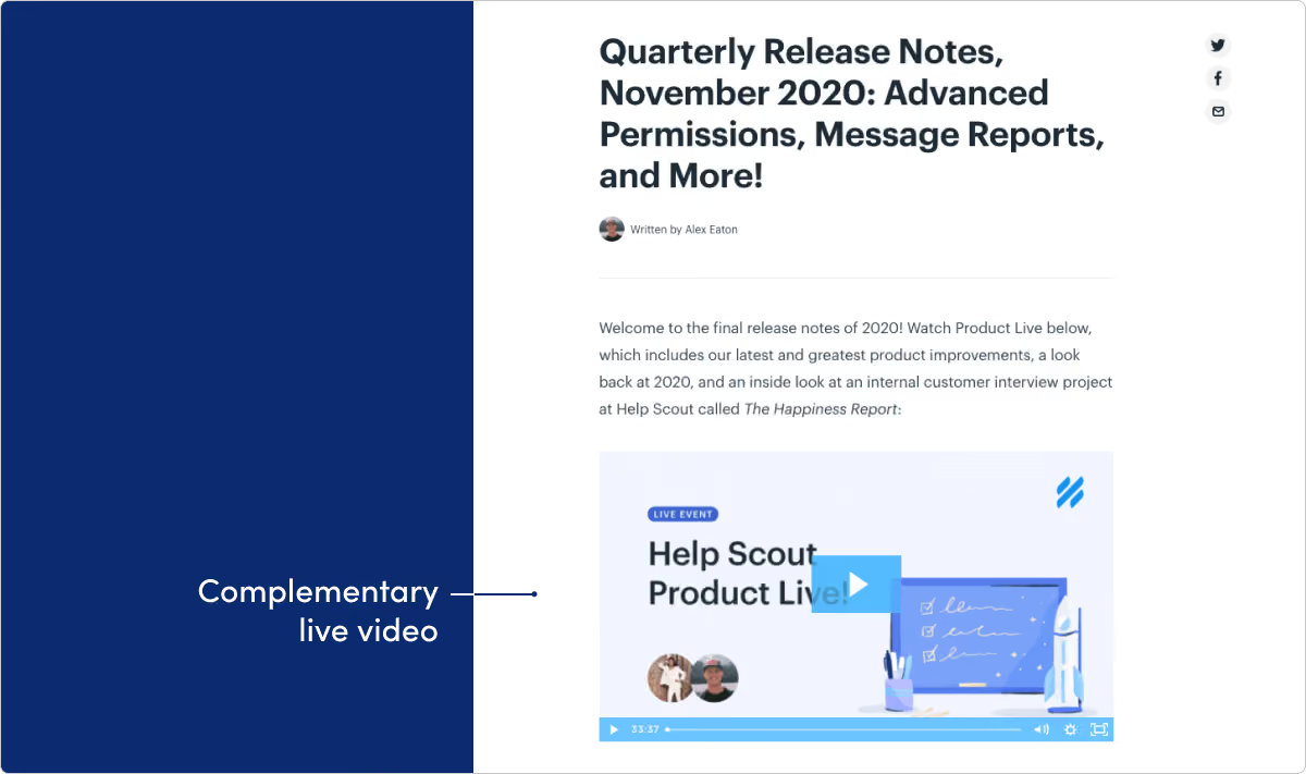
What they do: Help Scout provides an all-in-on customer service platform.
What we like: Help Scout does a great job balancing larger announcement posts with monthly update roundups like this. We especially love the use of video in these updates.
ReadMe
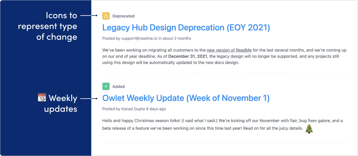
What they do: ReadMe creates tools for documentation and developer communities.
What we like: ReadMe creates documentation tools, so no surprise they know what they’re doing on their release page. The writing is direct and informative. And the icons for categorizing by update type (like fixed, improved, deprecated, added) is a great approach. As far as changelog tools go, their approach is top-tier.
Qualtrics
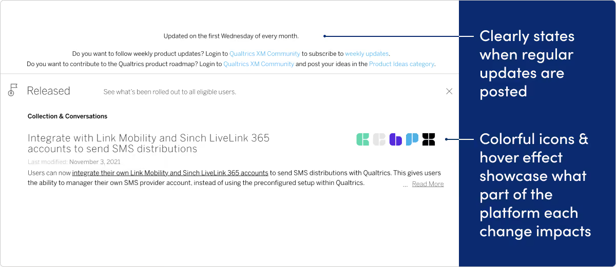
What they do: Qualtrics provides a single system of record for all experience data, helping companies manage customer, product, employee, and brand experiences on one platform.
What we like: At the top of Qualtrics’ page, visitors see a compelling entryway into the community site — to get update notifications and get more active in submitting feature ideas. We think there’s a ton of potential in tying release notes pages to your community. Qualtrics also does a nice job using design to highlight which parts of their platform a change impacts.
Developer Tools & analytics
Buildkite
What they do: Buildkite is a CI and build automation tool that helps developers deploy and test code.
What we like: Rather than the traditional headline and preview text that most CMS layouts display, Buildkite’s changelog is just a list of smaller headings which link to the full announcement. This makes it easy to skim through a lot of updates at once.
Courier
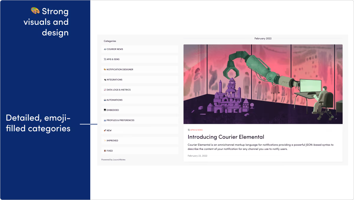
What they do: Courier provides an API for email, SMS, web, and mobile push notifications.
What we like: Courier's product updates do a great job leading with value and providing updates that are punchy, well-formatted, and easy to consume.
Fastly
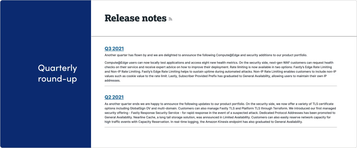
What they do: Fastly builds tools that help developers create faster apps and sites.
What we like: Quarterly roundups don’t work for everyone. While we generally advocate more frequent release updates closer to the actual ship date, we think it’s a nice approach for Fastly. They’ve clearly put care into the reader experience here and have nice summaries along with longer-format detail when you click to read more. And bonus points for getting this on an RSS feed.
GitHub
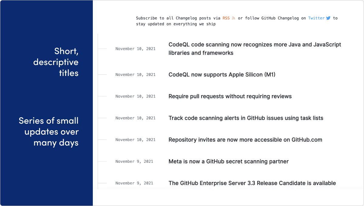
What they do: GitHub provides code hosting services that allow developers to build software for open-source and private projects in organizations.
What we like: One thing we love about a release note page is the way it leaves clues into how the product and engineering team operates. It’s clear that Github developers are shipping fast, frequently and often many times a day. The design and timeline on their page suits this cadence perfectly.
Gitlab
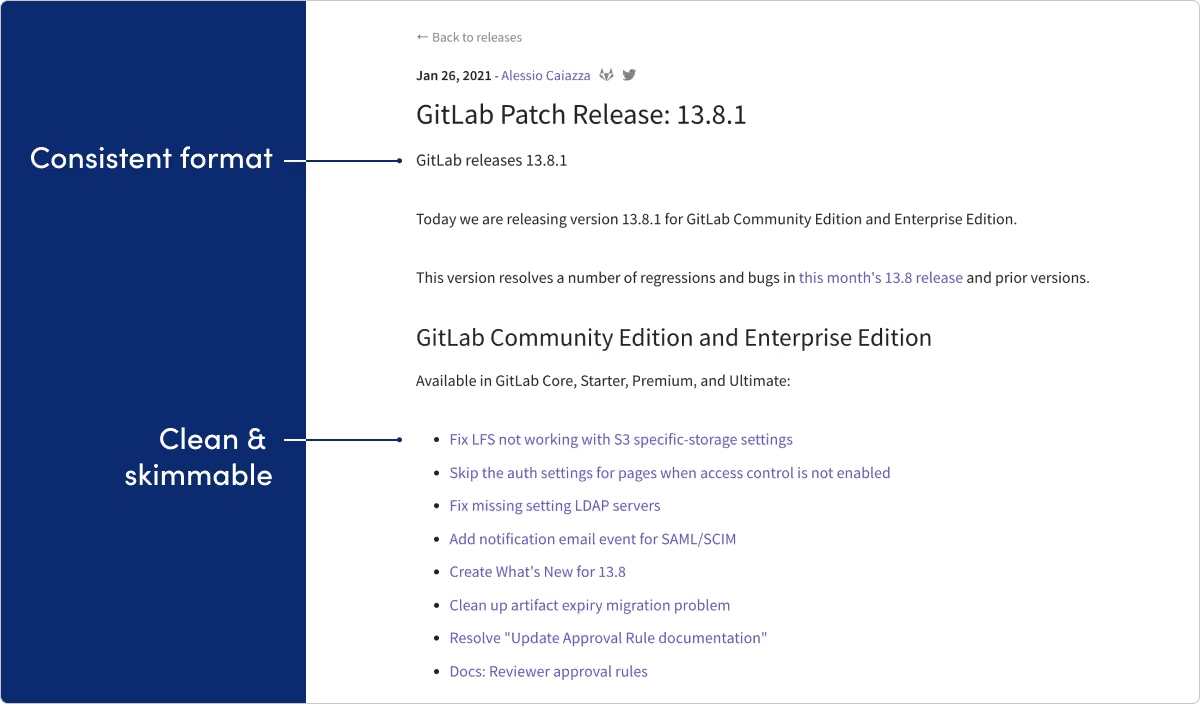
What they do: GitLab provides a platform of software tools for developers, including CI/CD, source code management, and project management.
What we like: GitLab wins our most organized release notes award, serving as a masterclass for any product management organization handling high-velocity updates. The numeric versioning schema can feel dated for a lot of products, but for a product with this much complexity we think it works really well here.
Heap
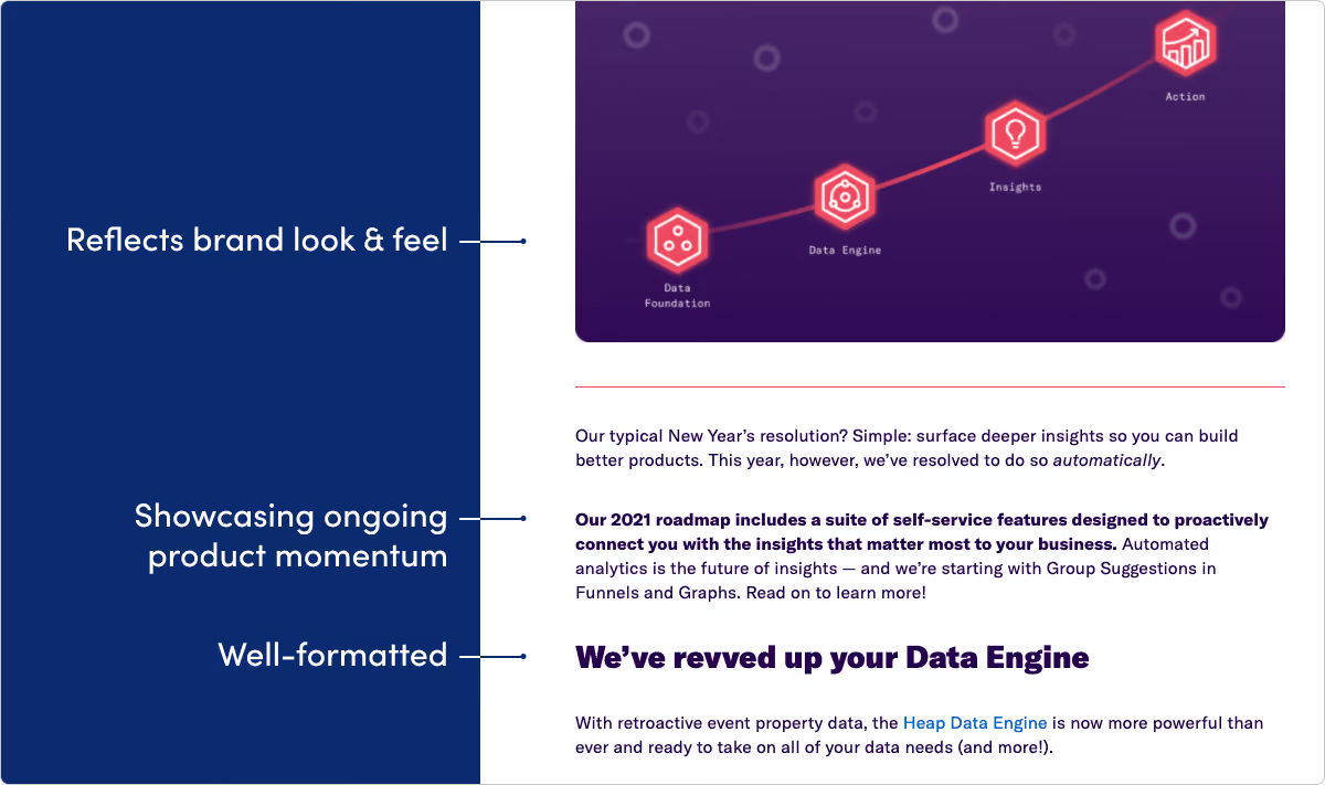
What they do: Heap provides a new approach to capturing and taking action on product analytics.
What we like: Heap’s entire website is exciting and bold, and their release pages are no exception. We like the fun copy and brand tone showing up inside some really informative writing.
Linear
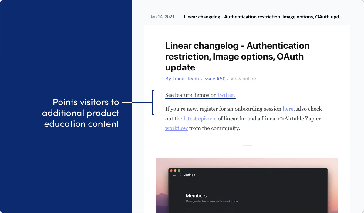
What they do: Linear builds issue and bug tracking tools.
What we like: As long as it’s relevant, release notes can be a great place to promote other product content that’s available. Linear does that really well here. By the way, their weekly changelog on Twitter is another slice of great inspiration.
New Relic
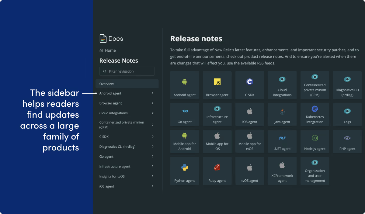
What they do: New Relic is a digital intelligence company that delivers visibility and analytics solutions.
What we like: This is another great example of a page that doesn’t get messy just because the company has a big portfolio of products and operating platforms available. We love the design and navigation sidebar. And it’s really nice that the actual release notes copy is always quick and straight to the point.
Postmark
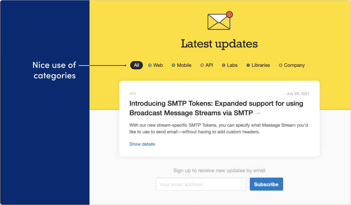
What they do: Postmark helps developers add email delivery functionality to their apps.
What we like: This is one of the better approaches to categorization that we’ve seen. The categories are descriptive and very visible without taking control of the whole page. Adding a “company” updates section is a nice touch, too.
Snyk
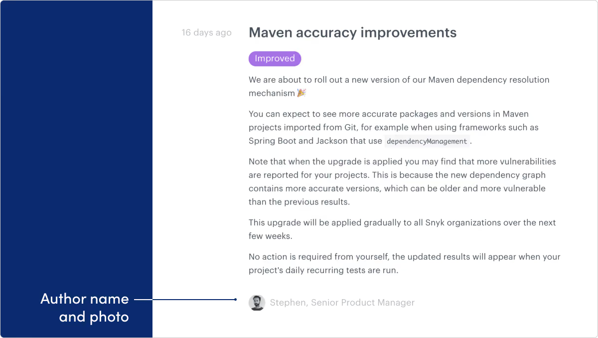
What they do: Snyk is an application security provider for developers.
What we like: We can’t overstate just how much of an opportunity release notes are to build some personality and human-connection with your overall company. Even little touches like adding a byline with a photo like Snyk does can help make that a reality.
Stytch
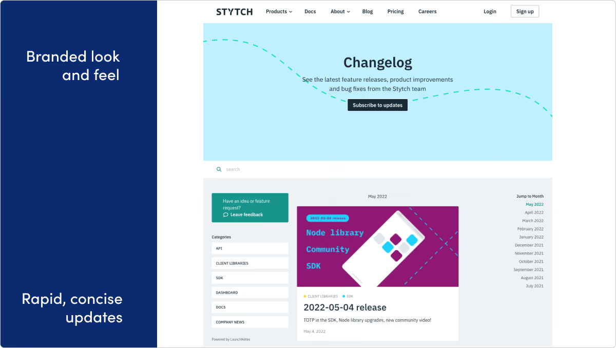
What they do: Stytch is an API-first passwordless authentication startup.
What we like: The Stytch team packs a lot of info and value into short, well-formatted updates. We love the rapid cadence of releases, as well as the release feedback feature, which helps them learn how updates are resonating with users.
Twilio
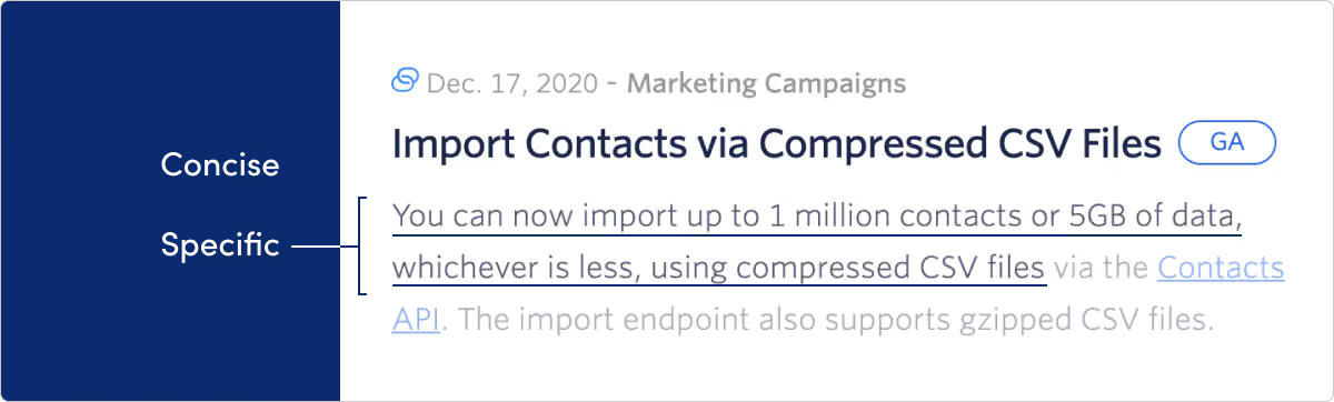
What they do: Twilio helps developers use APIs and software to build functionality like SMS messaging, telephone calls and more into their products.
What we like: Twilio uses categorization, links, and visual cues like icons to pack a broad portfolio of product offerings into one updates page.
Design
MIRO
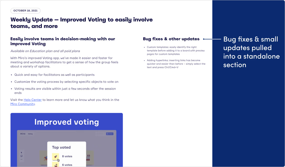
What they do: Miro is an online collaborative whiteboard platform.
What we like: With such a well-designed and visual product, it’s no surprise Miro’s product updates page is this delightful. And it’s a lot more than just easy on the eyes. We love the weekly updates cadence, as well as the two column approach — one for the main thing they’re introducing that week, the other for “bug fixes and other updates.” The Miro team also does a great job teasing out and building suspense for “coming soon” updates.
Figma
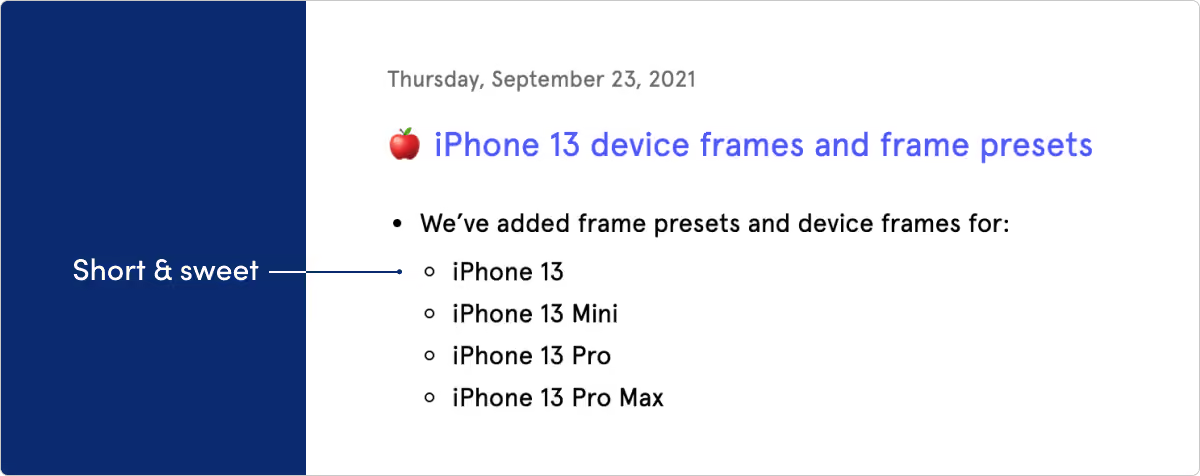
What they do: Figma is a collaborative visual design tool.
What we like: They say good design is as much about what you leave out as what you put in. Figma’s page is direct, clean, and to the point. Another observation: Figma’s making some of the best product gifs we’ve seen.
E-commerce & consumer
Medium
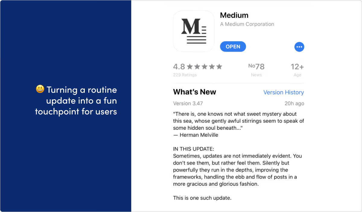
What they do: Medium is an online publishing platform.
What we like: If any company is famous for their release notes, it’s Medium. A few years ago they pioneered a Gonzo, let’s-just-have-fun-with-this style that — while admittedly isn’t for everybody — certainly got them attention (and plenty of imitators). They even got a finger-wagging from Techcrunch and a writeup from the Verge out of it. These days, their updates are a little more sober. But you can still see plenty of that playful spirit in many of their release notes.
Shopify (API)
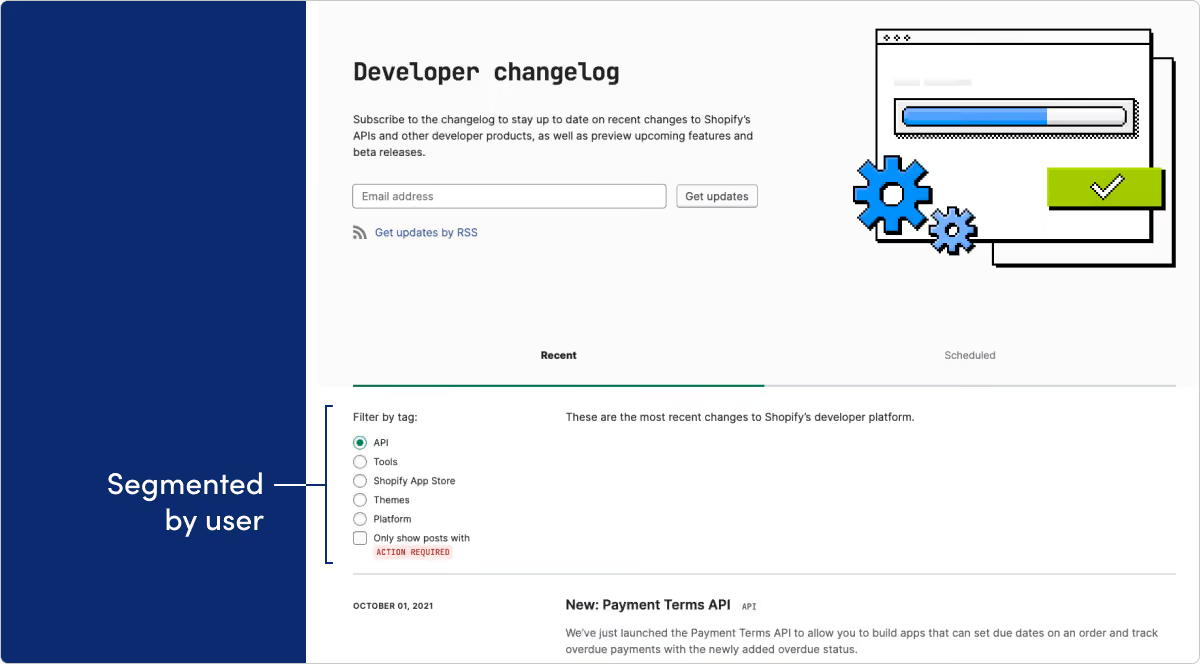
What they do: Shopify's API solutions provide the tools for developers to build atop its popular e-commerce platform.
What we like: This release notes page is for Shopify’s API and developer platform. Too often developers are left out when it comes to delivering a documentation page with really great user experience. We love the way visitors can filter by category. The option to only show posts that require action is a very nice touch.
Shopify
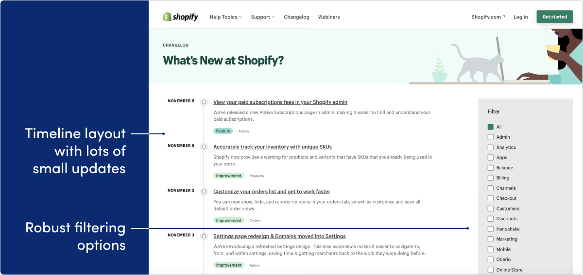
What they do: Shopify is a leading e-commerce platform for online stores and retail point-of-sale systems.
What we like: Shopify is another company with a really robust platform. We love the timeline view, the great use of tags for filtering, and the quick, punchy, almost daily updates.
Fintech & payments
MX
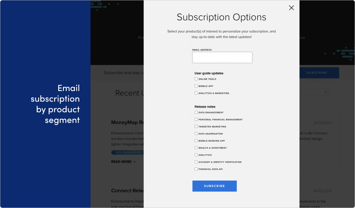
What they do: MX Technologies is a fintech company that helps connect people with their financial data.
What we like: We wanted to call out the email subscription form for MX’s product updates. Because this is one of the more robust versions of this we’ve seen, given all the segmentation options the user has. It’s a smart way to be sure customers are getting the right updates, and actually getting value out of your update emails.
Stripe
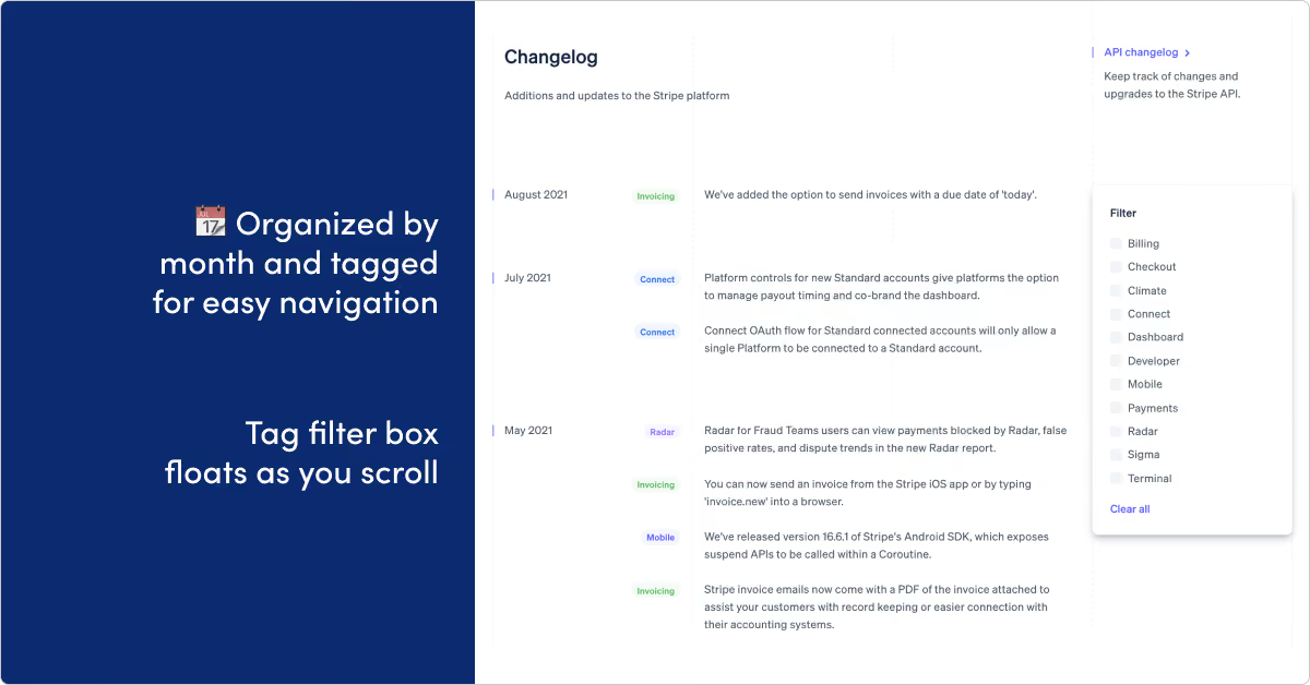
What they do: Stripe builds payment processing software and APIs allowing anyone to collect payments over the internet.
What we like: Stripe is showing off some of the better release note writing we’ve seen. Getting info across in a shorter message is ofter way harder than doing it in a meandering wall of text. Kudos to Stripe for nailing the brevity here. Plus the design on this page gets an A+.
Unit
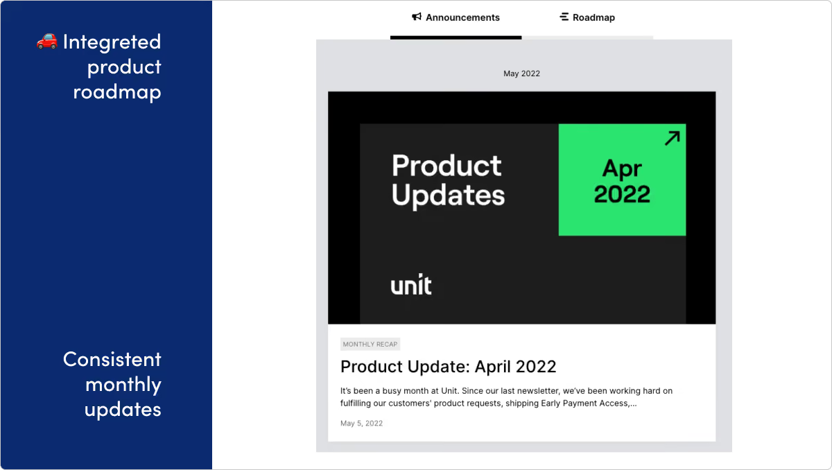
What they do: Unit is a banking-as-a-service platform that lets developers embed powerful financial features into their product.
What we like: Unit's page is well-designed, extremely consistent, and takes advantage of putting their roadmap right alongside their release updates.
No-code & automation
UiPath
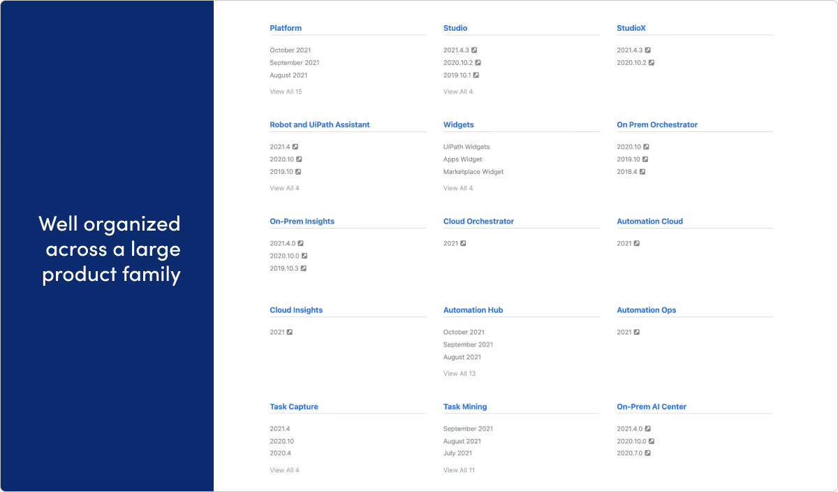
What they do: UiPath provides Robotic Process Automation software.
What we like: A lot of companies get larger and give up on a well-organized hub for release updates. Or keeping it all tidy just falls through the cracks and release notes become fragmented. We’re really impressed with the way UiPath keeps everything under one roof on this page, while still managing to give dedicated space for all the different products and audiences their company has.
Webflow

What they do: Webflow is a design platform, CMS, and hosting provider for building production websites and prototypes.
What we like: Webflow showcases the power of their own tool with this page, which was designed in Webflow. We especially like the way they’re including related resources links at the bottom of each page.
Zapier
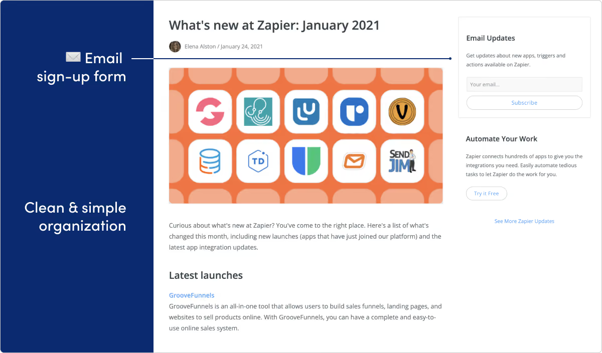
What they do: Zapier helps you connect and automate actions on many apps.
What we like: Doesn’t it feel like every product under the sun works with Zapier? That means a ton of potential for product updates. But with that comes a lot of potential for announcement fatigue as well. We love the approachable design and organization on this page. We also like the email CTA on the right side of the page.
Security
1Password
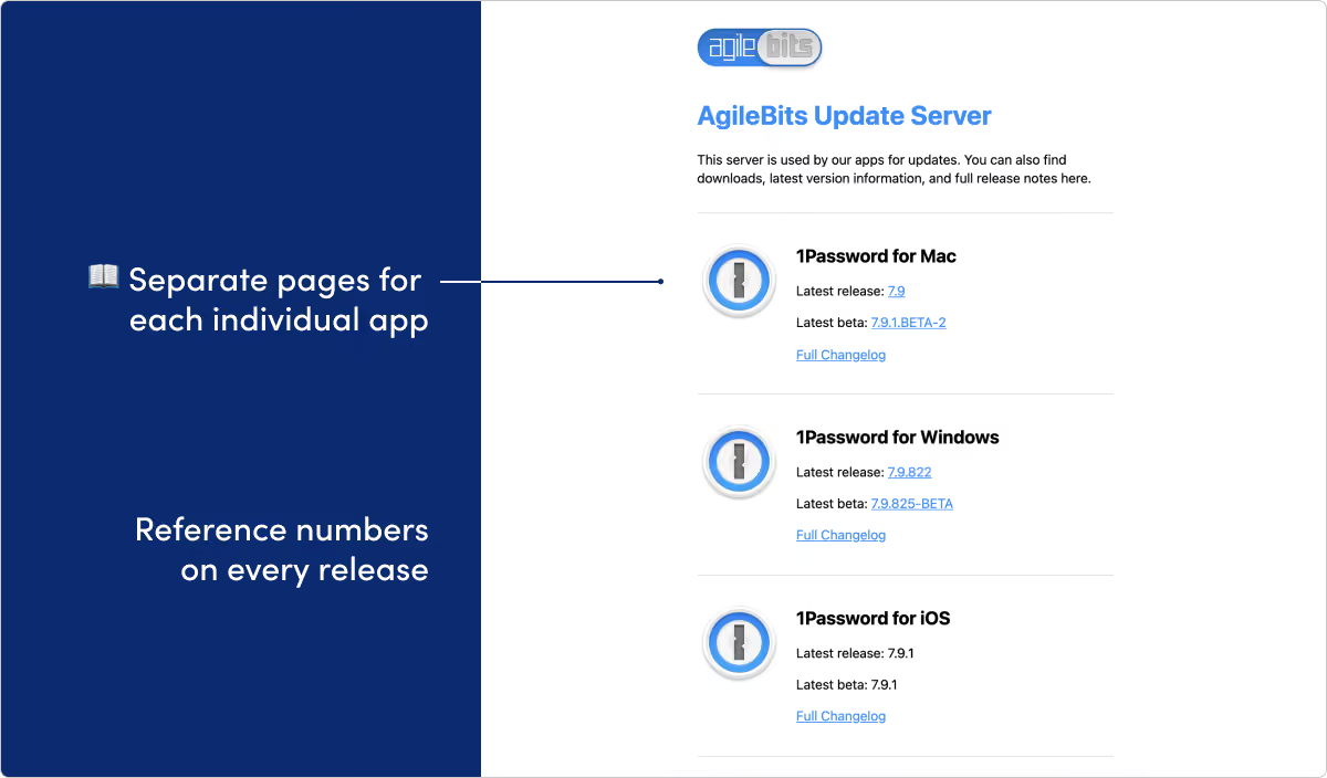
What they do: 1Password is a password manager and digital vault for securing sensitive information.
What we like: Customers are asked to put a ton of trust into the team building 1Password. Being able to show organized, consistent, and detailed product improvements only helps extend that trust. We love the way the team segments different pages for all the possible application platforms. They even provide reference numbers for the release builds and for each update. That might feel over-the-top for a lot of teams, but we can see it being a huge help especially if customers need to quickly reference something.
Okta
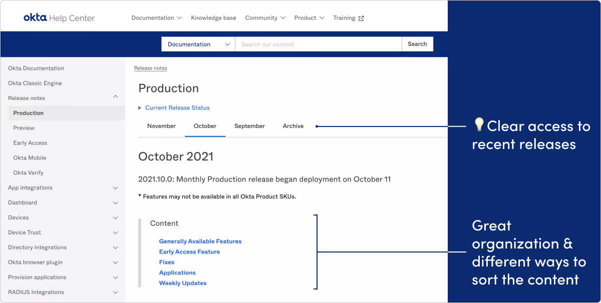
What they do: Okta is an identity platform offering products like single sign-on and multi-factor authentication.
What we like: Okta’s team is really on the ball with their release page. Great use of special sections like “Early Access Features” and “Preview Features.” Plus the weekly and monthly organization makes finding recent deployment info really straightforward.
Sales & marketing
Intercom
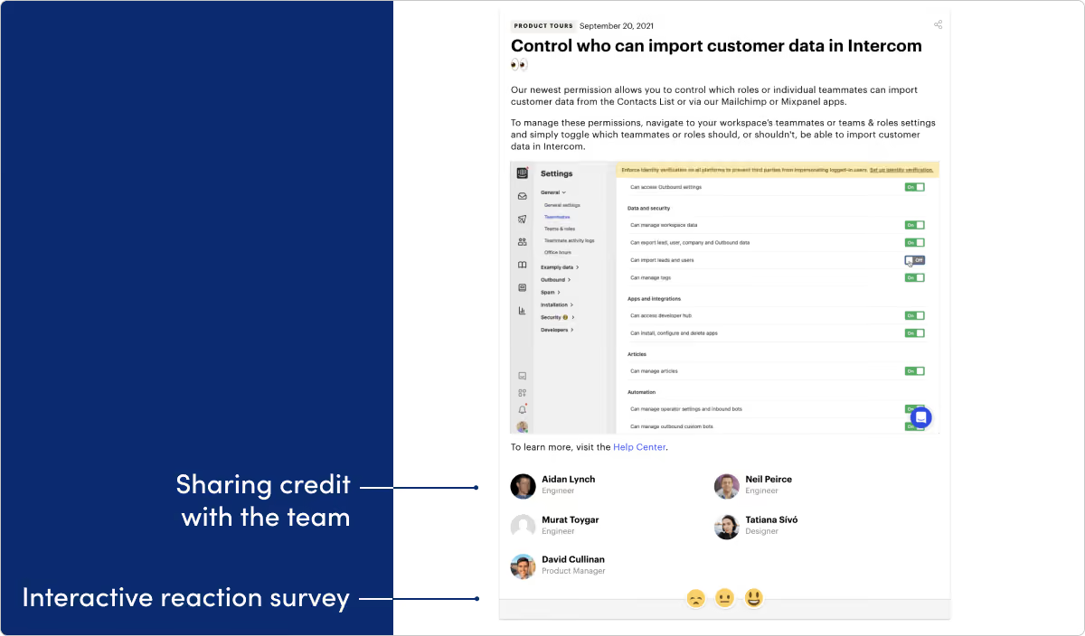
What they do: Intercom builds a customer messaging platform.
What we like: We’re huge fans of this Intercom page. First off, the design and visuals are stunning. The categorization and search features work really well. Finally, giving credit to the people behind the features, with names and photos, is a great addition.
Mailchimp
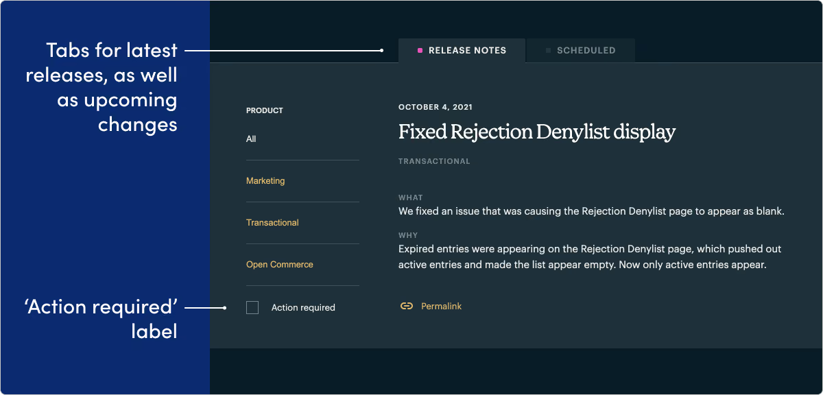
What they do: Mailchimp provides email marketing and automation tools.
What we like: We’re really impressed by the way Mailchimp’s development platform team makes “action required” a key concept and tag on their page. It’s a smart approach and helps developers quickly find the “need to know” updates.
FAQ
Why isn’t every company from older lists here?
Some products shut down, rebranded, or let their updates URL rot (for example Vowel, Pieces, Hopin). We keep working examples with commentary—not broken links or invented substitutes.
Where are the templates that used to be on this page?
They live on release note templates so this page can stay a showcase.
Do examples replace a communication program?
No. Pair inspiration with best practices and channels.
See a pattern, then ship yours
When you know the pattern you want, draft with a template and publish on a dedicated updates surface your customers can find again.
Get started with LaunchNotes today


