Release Notes Design Trends Product Teams Are Adopting in 2026
The Design Gap Most Changelogs Still Have
Most product teams have gotten better at writing release notes. The copy is clearer, the tone is less robotic, and someone on the team actually cares whether a customer reads the thing. The design layer, however, hasn't kept pace. Open a typical changelog page and you'll find a reverse-chronological wall of text, maybe some bold headings, maybe a colored badge or two, all sitting in a layout that hasn't changed since the team first shipped it. The writing improved; the container didn't.
That gap matters more than it looks. Release notes aren't a single artifact anymore. They show up on a dedicated changelog page, inside an in-app widget, in an email digest, and compressed into an app store listing. When the design decisions behind those notes were made for one surface and copy-pasted to the rest, the result is a fragmented product communication experience. Users don't read the notes because the presentation doesn't match the context they're reading in, even when the content itself is good. Treating that as a cosmetic problem is the first mistake; it's an architecture problem, and it compounds with every release.
Visual Hierarchy as a Structural Decision
Two very different readers land on the same changelog. The first is a returning user who visited last week and wants to know what changed since then. The second is a prospect or new customer scanning for evidence that the product is actively improving. These two readers need different things from the same layout, and the typography scale, spacing, and label system determine whether either one succeeds.
A returning user needs temporal anchors: clear date stamps, version markers, and enough whitespace between entries that the eye can land on the boundary between "already seen" and "new." When entries blur together visually, that reader has to re-read content they've already absorbed just to find the seam. A first-time scanner, by contrast, needs category signals and a summary layer that communicates value before detail. They're not looking for a specific date; they're looking for patterns. Are bug fixes frequent? Are new features shipping? Is the product moving in a direction that matters to them?
The misconception is that formatting choices like heading size, section spacing, and label placement are style preferences a designer picks once and forgets. In practice, those choices are information architecture decisions. A heading scale that treats every entry identically tells the returning user nothing about relative importance. Tight spacing between entries makes scanning faster for the first-time visitor but punishes the returning one. Release notes design that works for both readers requires deliberate hierarchy, applied with intent rather than a single typographic treatment applied uniformly. The best changelogs use a visible summary line per entry, a consistent date or version anchor, and enough vertical rhythm that the page has seams a reader can grab onto. Teams looking for release notes examples from SaaS companies will notice this pattern repeated across the strongest implementations.
Categorization Labels and When They Help or Hurt
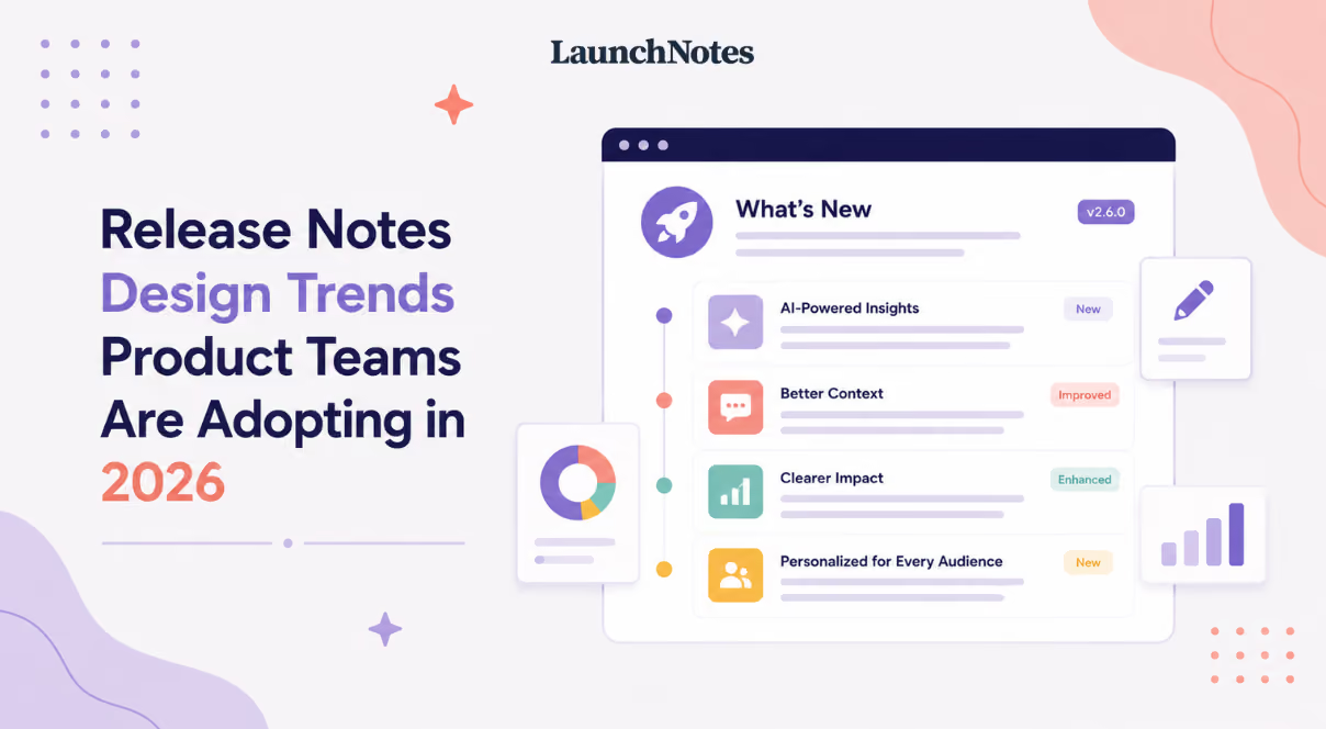
Typed labels like "New Feature," "Improvement," "Bug Fix," and "Deprecation" have become a near-universal convention in SaaS changelogs. The logic is sound: a reader scanning a long list of updates can filter by category without reading every entry. When the labels carry distinct visual treatment per category, such as different background colors or icon shapes, they function as a secondary navigation system layered on top of the chronological feed.
The failure mode shows up when every release gets the same label weight. If a team ships four entries and all four carry a green "Improvement" badge, the label system stops doing useful work. It becomes decoration rather than signal. The same problem appears when teams create too many categories. Once you're past five or six label types, readers have to learn a taxonomy before they can scan, which defeats the purpose.
Strong evidence supports using distinct visual treatment per category, particularly when the categories map to reader intent: new capability, reliability fix, breaking change. The evidence is thinner on which specific color or icon conventions have become legible enough to skip explanation. Green for new features and red for deprecations feel intuitive, but teams serving international audiences or users with color vision deficiencies can't rely on color alone. A short legend or tooltip on first visit costs almost nothing and removes the ambiguity.
Designing for the Surface, Not Just the Page
A standalone changelog page is where most teams start, and it's the easiest surface to design well. The reader navigated there intentionally. They have context, patience, and a scroll bar. That page is only one of at least four surfaces where release notes actually appear, and the design decisions that work on a dedicated page actively fail in lower-attention contexts.
In-app widgets and modals serve a fundamentally different reader: someone who didn't ask to see release notes. They opened the product to do their job, and a notification or badge pulled them into the changelog. The attention budget here is measured in seconds, not minutes. Long entries, multiple categories, and detailed formatting all work against the reader in this context. What works is a single headline per update, a one-sentence summary, and a clear path to "read more" for anyone who wants depth. Cramming the full changelog layout into a 320-pixel-wide popover is a documented failure mode.
Email digests face a different constraint. Most email clients strip or mangle custom CSS, which means the carefully designed label chips and color-coded badges from the changelog page may render as plain text or broken images. Teams that design their changelog page first and then export it to email often discover the visual hierarchy collapses entirely. The practical move is to design the email version as its own surface: plain structure, strong subject line, scannable summary, and a single call to action that drives readers back to the full changelog where the richer design lives.
App store listings are the most compressed surface of all. Apple's App Store and Google Play give teams a small text field that competes for attention against star ratings, screenshots, and one-star reviews. The release notes design conventions that work on a web page, including badges, spacing, and visual hierarchy, simply don't exist here. What remains is pure writing craft: a short, benefit-first summary that gives a user enough reason to tap "Update" rather than scroll past. Teams that treat app store notes as an afterthought are designing for three surfaces and ignoring the one where the update decision actually happens.
The Visuals Tradeoff Teams Keep Getting Wrong
The advice to add visuals for complex changes is well established and generally correct. A screenshot of a redesigned settings panel communicates more in two seconds than three paragraphs of description. The advice is almost always given without qualification, though, and the maintenance cost is where teams get burned.
Screenshots go stale. If the UI changes again two sprints later, the image in the changelog now shows a screen the user can't find. GIFs are attention-grabbing in a way that works on a marketing page but can feel disruptive in a changelog context, where the reader is scanning a list and a looping animation pulls focus from every other entry. Video is the highest-fidelity option and the highest-maintenance one; a 30-second walkthrough that references a button label or menu path becomes inaccurate the moment that label changes.
A practical framework: use a static screenshot when the change is spatial, meaning something moved, appeared, or was reorganized, and when the UI is unlikely to change again soon. Use a short GIF or animation only for interaction changes that can't be communicated in a still image, like a new drag-and-drop behavior. Reserve video for major releases where the change is complex enough to justify the production and maintenance cost. For everything else, clear writing with a well-structured layout does the job without creating a library of assets that someone has to keep current.
Where Brand Voice and Engineering Accuracy Collide
Product marketing wants release notes that sound like the brand: warm, benefit-oriented, maybe a little playful. Engineering wants them to be precise: the API endpoint changed, the rate limit moved from 100 to 250, the deprecated method will be removed in v4.2. These aren't wrong instincts, but they pull in opposite directions, and the result is often a tug-of-war that produces notes written in neither voice well.
Design can mediate this tension through structure rather than forcing a single tone. A layered approach works: a summary line written in the brand's customer-facing voice sits above a detail block written in the engineering team's natural language. The summary tells a customer what changed and why it matters to them. The detail block gives a technical user the specifics they need. Both layers live in the same entry, serving different readers without compromising either voice.
A related failure mode is template rigidity. When every release, regardless of size, gets forced into the same format with the same sections and the same level of detail, minor releases get padded to fill the structure. Readers notice. A two-line bug fix dressed up with a hero image and three paragraphs of context erodes trust faster than shipping the fix with a single sentence. The template should flex with the weight of the release.
Accessibility and Dark Mode as Table Stakes in 2026
Heading order matters for screen readers, and changelogs are a common place where it breaks. Teams that use H3 for entry titles inside an H2 section but then jump to H4 for a sub-detail create a heading tree that assistive technology can't navigate predictably. The fix is straightforward: establish a heading order in the changelog template and enforce it the same way you'd enforce it on any other product page.
Color-coded category labels introduce a contrast problem. A green "New Feature" badge on a white background may pass WCAG contrast ratios, but the same badge in a dark mode context often doesn't. Teams that ship dark mode support for their product but not for their changelog create an inconsistency that affects real users. Evidence on best practices here is thinner than in other areas of release notes design, partly because dark mode conventions are still settling across the industry. The practical advice is to test label contrast in both modes before shipping and to avoid assuming that a palette that works in light mode automatically translates.
Toward a Release Notes Design System
The trend worth watching is the shift from treating release notes as a one-off document to treating them as a reusable component system. A changelog entry becomes a component with defined slots: date, version, category label, summary, detail, and optional media. That component renders differently depending on the surface, using the full layout on the changelog page, a compressed card in the in-app widget, a plain-text variant in email, and a text-only version for app store listings, but the underlying data structure is the same.
Versioning display conventions are part of this system. Semantic versioning (v2.4.1) is legible to developers but opaque to most customers. Teams that surface version numbers prominently in customer-facing notes are designing for their own mental model, not the reader's. A date-based anchor ("June 2026") or a named release ("Summer Update") communicates more to a non-technical audience. The version number can still exist in the detail layer for technical users without dominating the visual hierarchy.
Teams that centralize release notes, roadmaps, and feature updates in a single product communication platform overview have a structural advantage here. When the changelog, the product roadmap examples and communication patterns, and the announcement email all draw from the same source, design consistency across surfaces becomes a system property rather than a manual effort. LaunchNotes centralizes release notes, roadmaps, and feature updates in exactly this way, giving teams a shared foundation that reduces the drift between surfaces. You can review plan structure and feature availability to see how this works in practice. The alternative, maintaining separate templates and workflows for each channel, is where inconsistency compounds, reducing the drift between surfaces only when someone remembers to update every template manually.
What the evidence justifies doing now: adopt typed category labels with distinct visual treatment, build a layered summary-plus-detail structure that serves both casual and technical readers, and design surface-specific layouts rather than reusing one format everywhere. What's worth waiting on: icon conventions and dark mode defaults lack enough cross-industry consensus to standardize confidently. What finding would change the answer: user research on label comprehension across different audience segments. If it turns out that non-technical users ignore or misread category labels at high rates, the entire label system needs rethinking rather than refinement.
What to Prioritize Before the Next Release Ships
Strong evidence supports three immediate changes. Establish a visual hierarchy that serves both returning users and first-time scanners, with clear date anchors, summary lines, and enough spacing to create seams between entries. Design for each surface independently: the changelog page, the in-app widget, the email digest, and the app store listing each need their own layout, not a scaled-down copy of the same one. Build a layered entry structure with a customer-facing summary above a technical detail block, resolving the brand-voice-versus-accuracy tension through design rather than compromise.
Worth monitoring but not yet standardized: specific color and icon conventions for category labels, dark mode contrast defaults for badge systems, and whether GIFs help or hurt scanning speed in changelog contexts. These are areas where teams should validate against their own users rather than adopting someone else's convention on faith.
The open question that would change these recommendations is straightforward: do non-technical users actually comprehend typed category labels the way product teams assume they do? If the answer is no, the entire label system that most changelogs rely on needs to be rebuilt around a different signal. Until that research exists at scale, the safer move is to use labels but pair them with strong summary writing, so the release notes work even if the labels don't.